Smart switch lets you transfer data from your old phone to your new one. This app works by creating WiFi Hotspot.
Smart Switch lets users conveniently transfer data between devices and then migrate their data to their new phones. With Smart Switch my Phone, you can move your contacts, photos, messages and music with just a few taps.
It has freemium & premium versions.
The main objective of this project was to create a completely new and innovative design for the “Smart Switch” app. The client was looking for a design that enhances the product.
This is the design process, which I carefully applied and adapted to meet the unique demands of the project at every stage.
Collaborated closely with client to outline project’s goals and objectives to ensure a clear and shared vision from the start.
Conducted research to uncover user needs around data transfer, identified pain points, and studied market dynamics. Analyzed competitors to spot opportunities and challenges, providing a foundation for strategic design decisions.
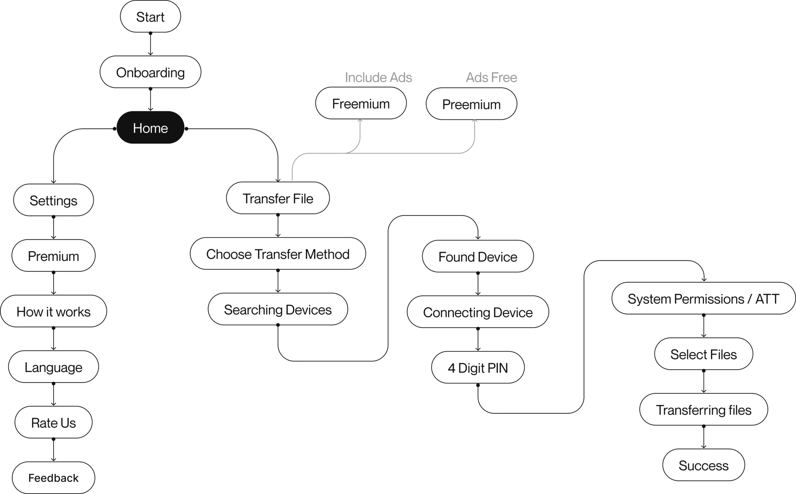
Design clear user paths to ensure smooth interactions while transferring data, create mood boards that shape the visual vibe, and integrate fresh UI trends for a modern and engaging experience.
Sketch wireframes to structure the layout, establish a design system for consistency, craft precise UI elements, and build a prototype to validate user flows.
I took feedback from PM & PO, refined the design through iterative improvements, and smoothly hand off the project to development for seamless implementation.
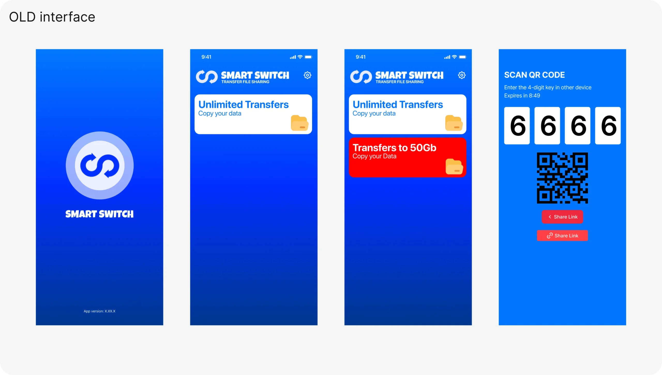
My research and interviews have revealed the primary issues that must be tackled to develop an app that truly satisfies the needs of users.
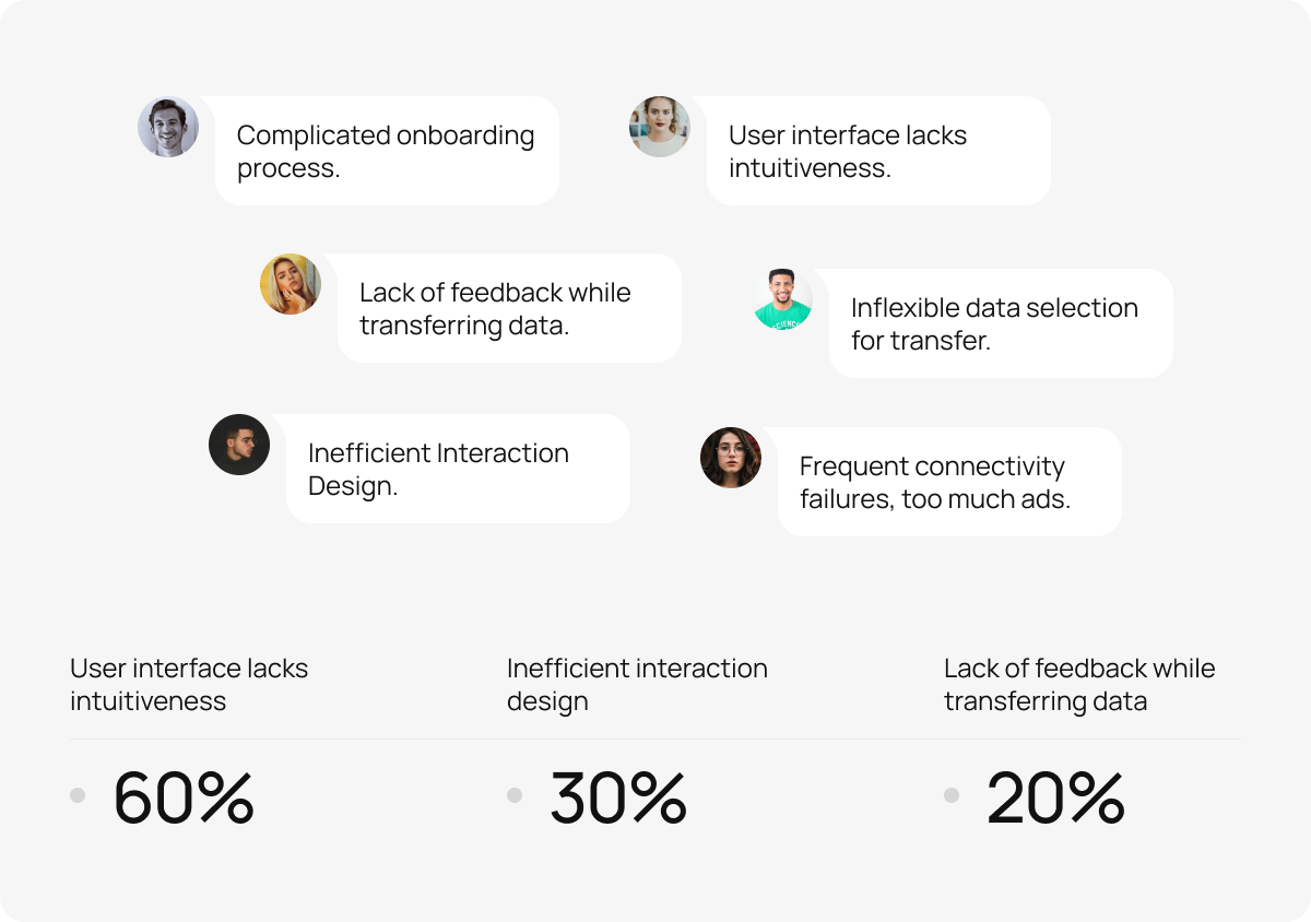
After conducting research and identifying key problems, here are my solutions that address all user requirements:
Designed the onboarding process in 6 steps that show full product functionality interaction, allowing users to engage with its features right from the start.
I designed it with a user-friendly interface and modern aesthetics that adhere to the latest design standards and contemporary color schemes.
After modernizing the app, it has a unique personality and aesthetics that match latest design standards and color schemes.
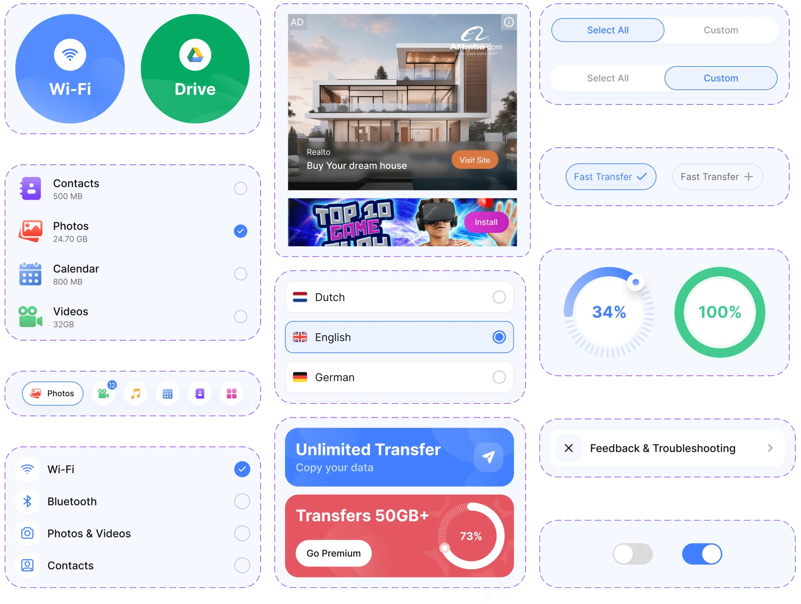
The new design was created with customer flexibility in mind for data selection during transfer.
To fix the lack of feedback during data transfer, we added real-time progress indicators and clear notifications to keep users informed throughout the process.
I improved the interaction design by simplifying navigation and enhancing user flows, ensuring a smoother and more intuitive experience.
Enhanced connectivity reliability with designing the app placements in both freemium and premium versions so that users can transfer data without facing connectivity problem and facing lack of ads while transferring data.
Implemented the CMP (Consent Management Platform) prompts and ATT (App Tracking Transparency) features, as well as push notifications. Also permission prompts are also set to present an engaging manner to enhance user experience and improve the conversion rate (CR).
I developed a unified design system with reusable components, ensuring consistency in color, variants, and UI elements. This streamlined collaboration and improved design efficiency while maintaining a cohesive user experience.
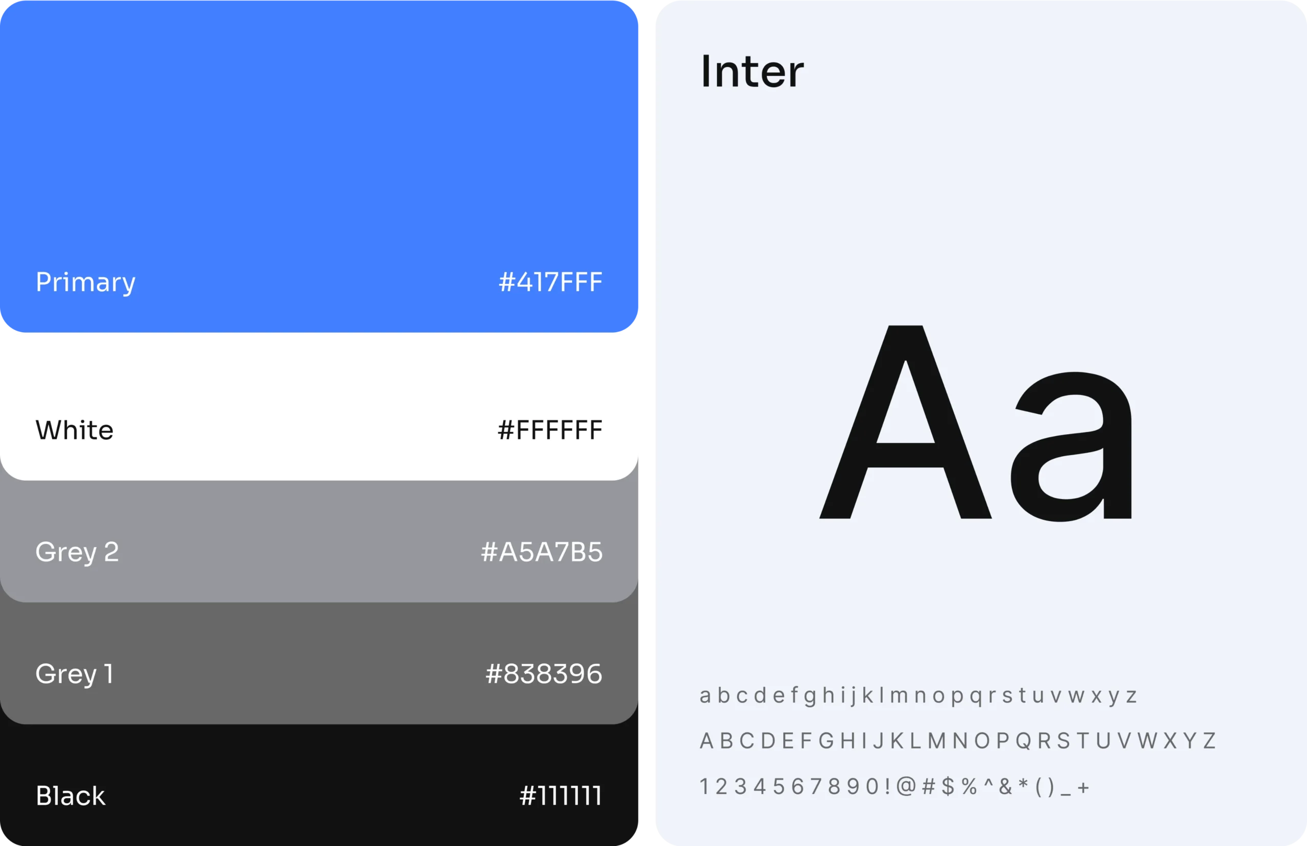
We selected blue as the primary color for a modern, fresh look, paired with the Sora font for its readability and contemporary style. Together, they create a cohesive and appealing design.
Designed the onboarding process in 6 steps that show full product functionality interaction, allowing users to engage with its features right from the start.
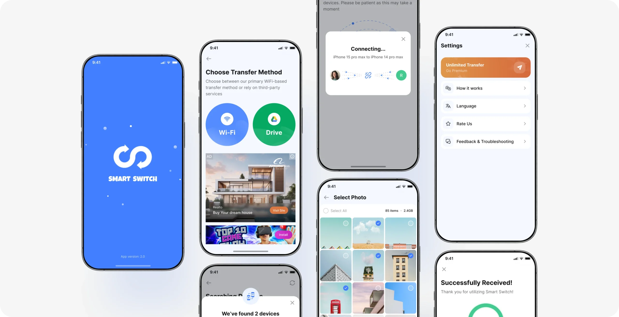
The main page provides distinct versions for freemium and premium users. Freemium users will encounter ads while using the app, whereas premium users enjoy an ad-free experience.
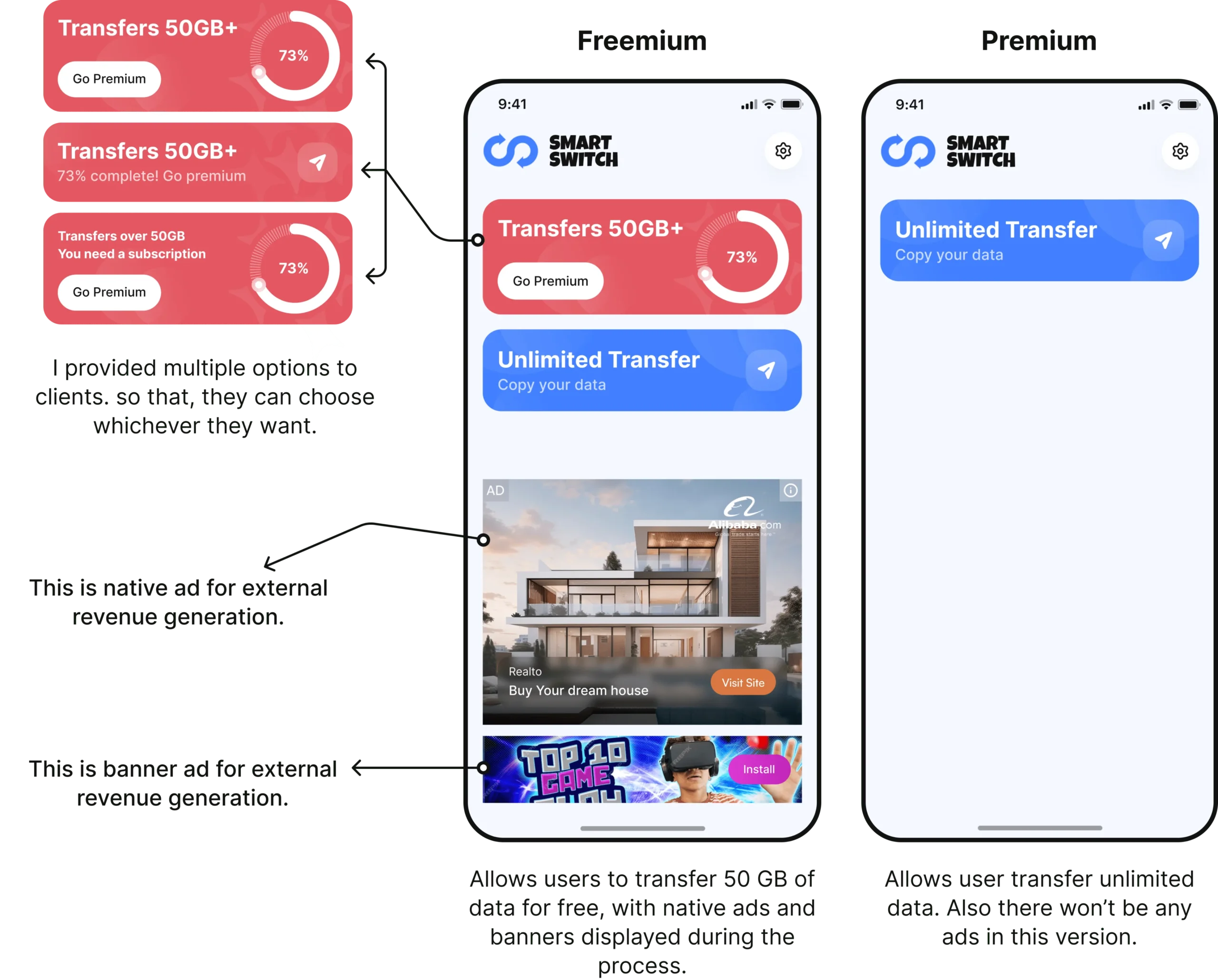
Here’s the complete transfer process for both Freemium and Premium users. The Freemium version features native and banner ads, while the Premium version offers a completely ad-free experience. I also integrated App Tracking Transparency (ATT) and push notifications to boost user engagement and privacy.
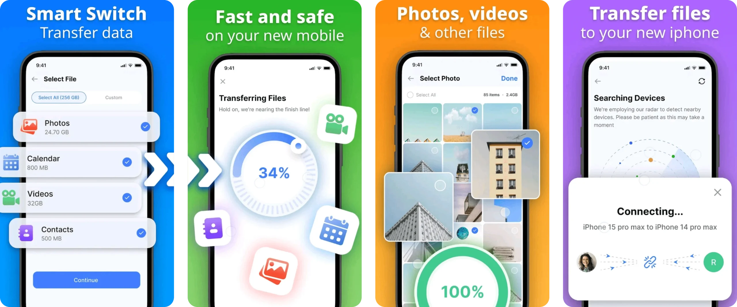
Instead of using images, I opted for videos to demonstrate the processes, making the case study quicker to navigate and easier to understand.
The settings page provides users with various customization and engagement options to enhance their experience. From “Go Premium” CTA to feedback, users can easily navigate through important features.
With the project successfully completed, the app is now live on both the App Store and Google Play Store. Below are screenshots from the Google Play Store. Feel free to click the 'Google Play' or 'App Store' buttons to explore the app.
The redesigned Smart Switch App has significantly enhanced the user experience and overall app performance. By streamlining data transfer processes and implementing a clear, intuitive user interface, user engagement and satisfaction have noticeably increased.
The freemium and premium versions are designed to accommodate different user needs, with the premium experience offering an ad-free environment. Overall, the revamped design has boosted the app’s market value as well as increasing revenue and user appeal.
I am available for full-time job, freelance or any contract project. Let’s talk