
Eno is a European financial technology company that develops software solutions for finance departments that help automate accounting. The company offers a suite of software solutions that can be tailored to the specific needs of each client when it comes to different areas of work such as accounts payable, approvals, purchase orders, bank reconciliations and financial reporting.
In this project, I worked as a UX designer & researcher and the final UI designer. I gathered user insights through research, then used that data to design intuitive, visually appealing interfaces, ensuring the final product met user needs and business goals.
There were over 130 screens, all of which were confusing due to significant UX issues. Some of these problems are described below.
UX had significant issues that made navigation difficult and frustrating.
Color scheme posed challenges, making it difficult to use and reducing overall usability.
Design felt cluttered and lacked sufficient spacing, leading to a cramped and overwhelming user experience.
Buttons were poorly placed, leading to confusion for users.
UI was outdated, lacking both intuitive functionality and aesthetic appeal.
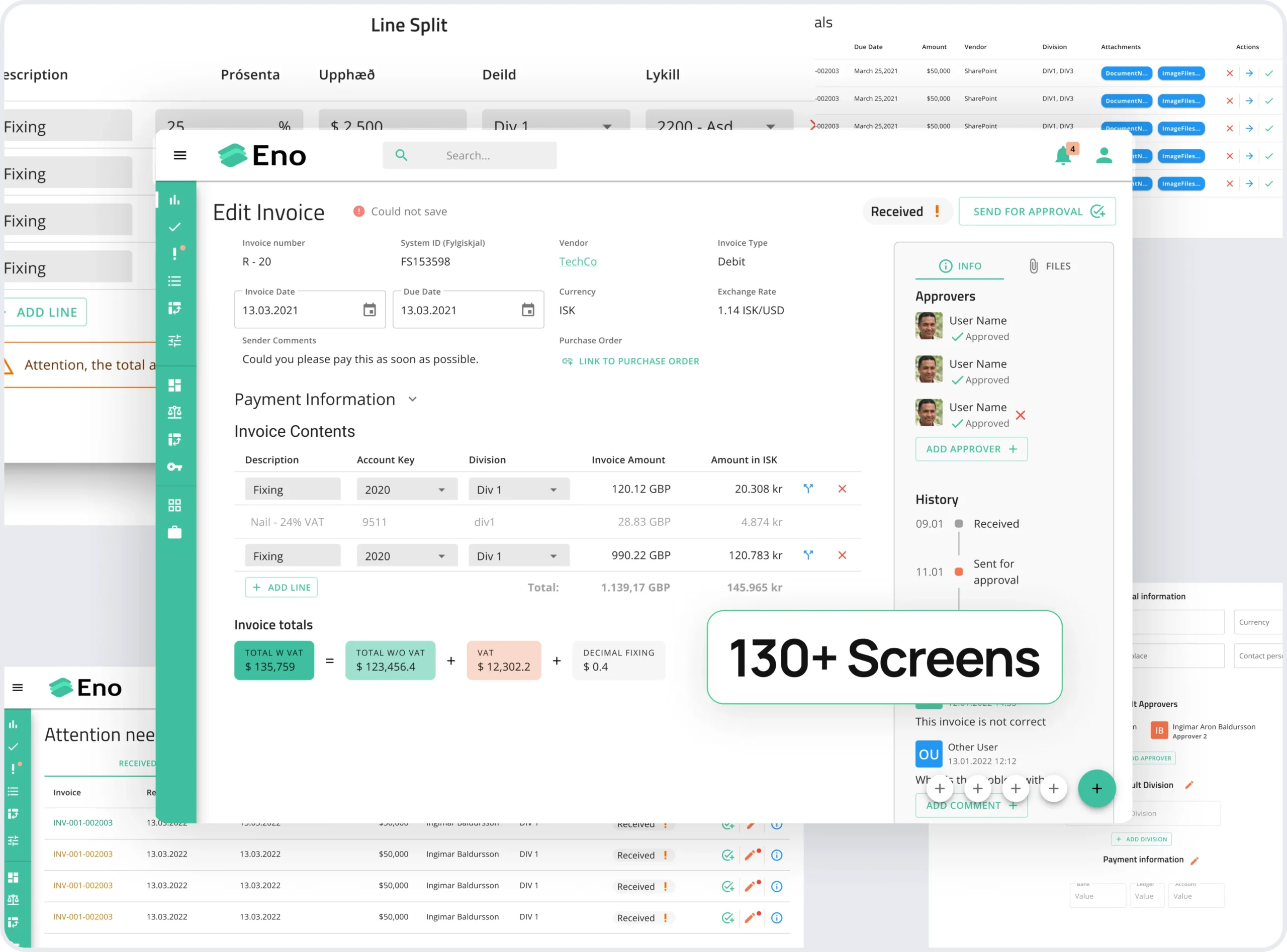
The project had significant UX problems that made navigation confusing and frustrating for users. In addition to the complexity of over 130 screens, the color palette lacked coherence, affecting both usability and accessibility. The design was cluttered, with insufficient spacing, causing cognitive overload, and buttons were poorly placed, confusing users during key actions like commenting. The outdated UI further lacked modern appeal and intuitive design. Addressing these issues was crucial to creating a more streamlined, user-friendly, and visually appealing interface.
To address the UX and UI issues, the following solutions were implemented as improvement which collectively enhanced the overall user experience, making the interface more intuitive, visually appealing, and easy to navigate.
The structure of the 130+ screens was reorganized, streamlining navigation to ensure a more logical and user-friendly flow. Key actions were made easily accessible to reduce user frustration.
A more cohesive and user-friendly color palette was introduced to enhance usability. The new colors not only improved visual clarity but also ensured better accessibility, reducing strain for users.
The cluttered design was cleaned up by increasing spacing between elements, creating a more balanced and breathable layout. This improved readability and reduced cognitive load, making the interface more intuitive.
Buttons were strategically repositioned to align with common user patterns, making actions like commenting more intuitive and accessible, thereby reducing user confusion.
The outdated UI was redesigned with a modern, clean aesthetic that combined both functionality and visual appeal. The new design focused on enhancing usability while maintaining a contemporary, professional look.
I successfully delivered the project, achieving all milestones along the way. I improved the app's functionality, making the "Eno" app more user-friendly and greatly enhancing the overall user experience. The screenshot below shows how pleased he was after getting the final design.
